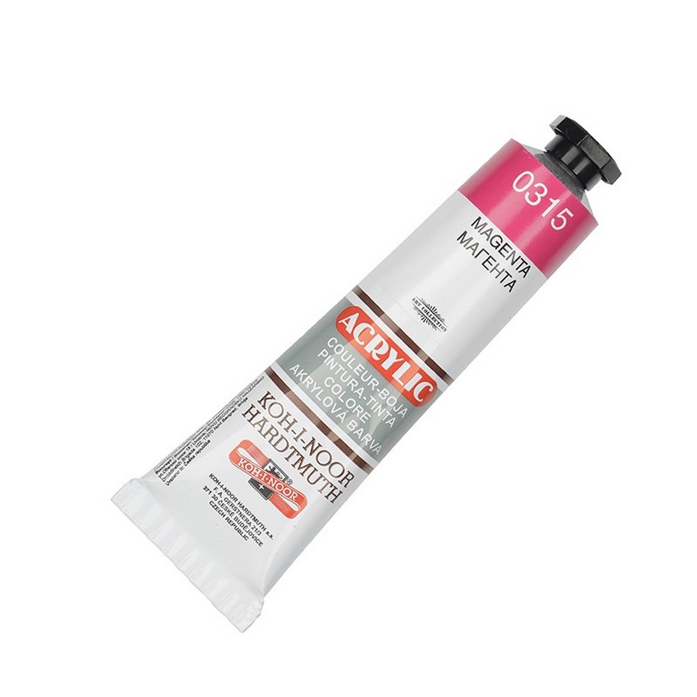
Akrylowa farba Koh-i-noor 40 ml Magenta
4.14 EUR
W magazynie
Koh-i-noor Acrylic Paint 40 ml, Magenta
Koh-i-noor Acrylic Paint in Magenta is a vibrant, cool-toned red with a distinct bluish-purple undertone, functioning as a modern primary for color mixing. This 40 ml tube contains a professional-grade, water-based acrylic formula prized for its intense, clean pigmentation and excellent lightfastness. As a crucial color on the contemporary artist's palette, it dries to a permanent, flexible, and waterproof finish and is indispensable for mixing a vast range of pure violets, bright pinks, and rich purples that cannot be achieved with traditional warm reds. It is a fundamental color for achieving brilliant, non-muddy secondary mixes.
Product Features & Technical Specifications
- Cool, Bluish-Red Primary Pigment: A magenta hue, which acts as a primary red in modern color theory (CMY), essential for mixing clean secondary colors, especially purples and violets.
- Professional Water-Based Acrylic: An artist-quality dispersion paint with smooth application, easy water dilution, quick drying, and simple cleanup with soap and water.
- High Tinting Strength & Transparency: Possesses strong staining power and good transparency, making it powerful for mixing and ideal for creating rich glazes.
- Permanent & Lightfast Finish: Dries to a durable, flexible, waterproof film with excellent resistance to fading, ensuring mixed colors retain their vibrancy.
- Universal Surface Compatibility: Suitable for all non-greasy, non-water-absorbent surfaces, including primed canvas, wood, paper, and craft materials.
- Superior Mixing Properties: The key mixer for creating clear, vibrant purples and violets with blues, and for adjusting the temperature of other reds and pinks.
- Convenient 40 ml Metal Tube: Packaged in a sealed, airtight metal tube that protects the paint's quality and allows for precise, controlled dispensing.
Primary Uses & Artistic Benefits
- Essential for Clean Purple & Violet Mixes: The primary red for mixing with blues (especially Phthalo or Ultramarine) to create the cleanest, most vibrant purples and violets without the muddiness caused by warm reds.
- Creating Bright Pinks & Fuchsias: Mixed with white, it produces a range of bright pinks, hot pinks, and fuchsia tones perfect for flowers, illustrations, and pop art.
- Color Temperature Control: Can be added to warm reds (like Cadmium Red) to cool them down or to create more complex, tertiary red-violets.
- Floral & Botanical Painting: Indispensable for painting fuchsias, certain orchids, bougainvillea, and other magenta-toned flowers with accuracy and brilliance.
- Graphic Art & Illustration: A staple for bold, modern illustration, design work, and any project requiring intense, cool reds and pinks.
Recommended Surfaces & Preparation
- Fine Art Supports: Primed canvas, wood panels, and heavy-weight paper.
- Preparation: For maximum vibrancy, apply over a white primer (gesso). A white ground is crucial for this transparent, staining color to shine at its brightest.
How to Use for Best Results
- Surface Prep: Ensure your surface is clean, dry, and properly primed with white gesso.
- Dispensing & Caution: Shake tube gently. Squeeze a small amount onto a non-porous palette. Warning: This is a potent stainer for brushes and skin.
- Application:
- For glazes and transparent effects: Dilute with water or glazing medium.
- For more opaque coverage: Use with minimal water or mix with a small amount of an opaque color like white or yellow.
- Key Mixing Formulas:
- Vibrant Dioxazine-like Purple: Magenta + Phthalo Blue (add magenta to blue gradually).
- Clean Violet: Magenta + Ultramarine Blue.
- Hot Pink: Magenta + Titanium White.
- Rich Crimson: Magenta + a small amount of a warm red (e.g., Cadmium Red Medium).
- Cleaning: Clean brushes immediately and thoroughly with soap and water. Staining on brushes and palettes can be permanent.
Professional Tips & Color Theory
- Modern Primary: In the CMYK (Cyan, Magenta, Yellow) printing/model, Magenta is a primary color, not a secondary mix of red and blue. This is why it mixes so cleanly with blues.
- Vs. Alizarin Crimson: Both are cool reds, but Magenta is brighter and less brown/murky. Alizarin is more transparent and better for deep glazes, while Magenta is better for bright, clean mixes.
- Mixing Clean Secondaries: For the brightest oranges, use a warm yellow with a warm red. For the brightest greens, use a warm yellow with a cool blue. For the brightest purples, use Magenta (cool red) with a cool blue.
- Handle with Care: Due to its high staining power, use dedicated brushes or be prepared for some permanent tinting of brush bristles.
- Storage: Always cap the tube tightly to prevent skin from forming.
Keywords
Koh-i-noor acrylic magenta, primary magenta paint, mixing color for purples, cool red acrylic, vibrant pink mixer, professional artist color 40 ml, staining acrylic paint, lightfast waterproof paint, modern color theory primary.